Your Design thru Delivery
We have created the following guidelines IF you want to create your own files. Although we can work with nearly any file, these guidelines will allow us to expedite your order processing and help to avoid setup time. We will also offer paneling, contour cut line development, along with color matching services. As a Pantone G7 color profiling shop you can be assured when following these guidelines all of your colors will match as closely as possible across mediums.
File Formats
EPS or PDF are preferred and will produce the best results. Please follow our Contour Cutting Guidelines Below. Other acceptable file types – PSD, AI, CDR, SVG, and PSB, are all acceptable if you choose to have us do any file setup, preparation, or paneling. As a note, if providing a PDF, PSD, AI, EPS, CDR, SVG, or PSB files, please also give a JPG “Proof” image. This proof is so we can make sure there is no element drop out, transparency issue, or other anomalies often associated with these file types. Please also provide the expected finish size so we can verify the correct size or scaling.
Image Resolutions
We recommend 150dpi for most large format print work. If the finished product is viewed from a distance greater than 15ft, resolutions as low as 100dpi are acceptable. Above 200dpi, the image quality difference is negligible unless being seen at extremely close ranges such as handheld and packaging items. Items viewed up-close like packaging, menus and business cards should be at 300dpi.
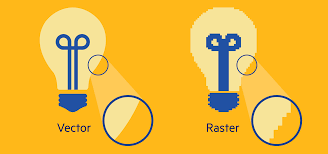
Vector files will always come out clearer and are preferred for anything large format. We can assist you if needed on creating files in a vector format. (AI, PDF). A raster file often can not be expanded in size without negatively impacting the quality.

Colorspace
We can accept files with RGB, CMYK, SPOT Colors, LAB Colors, and Greyscale colorspaces.
As a guideline, do not mix color spaces as there may be erratic results in color reproduction.
- By default we produce everything in-house in a CMYK colorspace.
- RGB is acceptable for vibrant color, saturated colors, or photo-reproduction. Using RGB will limit the accuracy of the colors provided, and future matching.
- A CMYK, LAB, or Defined SPOT color are required for accurate color output or matching.
- Greyscale is the preferred method for B&W printing to prevent color creep.
We employ our G7 & Gracol color calibration and normalization techniques to achieve accurate color reproduction. Images viewed on your monitor are not guaranteed to be accurate or match output. If a color is critical, please request color matching and provide a target color Pantone number. We can on request provide printed proofs for your approval before proceeding with production, do note that additional charges based on complexity will apply for this service.
For proper print output, please use these settings:
RGB: Adobe RGB (1998)
CMYK: SWOP2006_Coated3v2.icc
Intent: Perceptual
Proofing
If a proof is required, please notify us so we can add it to our proofing workflow. When providing “Print-Ready” files, it is the expectation that you are familiar with the design process. We are now starting to employ a semi-automated proofing process, and the responsibility of accuracy is on you. Please take the time to verify all order related information before approving. If color accuracy is critical, please request our color matching service. Please verify before submitting:
- All elements are present and visible.
- There are no hidden layers.
- There are no transparencies or gradients used in a layer over a spot color (spot colors on top layer)
- All Grammar and Spelling is correct.
- All fonts are outlines, and all assets embedded.
- Cut lines are present, named CutContour, and correctly setup.
- White color layers are present, named SPOT1, and set up correctly.
- Color matching target colors are Named SPOT colors. and matching Pantone number is referenced in your order
- Do not include bleeds or proof marks, unless you would like these to be on the final product.
General Print File Prep
- Fonts – To prevent errors, please outline or convert all fonts to curves. We can not guarantee accuracy with live fonts in a file. Even if you provide us a correct font, every design program handles fonts differently and there are other copies with the same names.
- Transparencies – To prevent errors in rendering, flatten all transparencies before saving and sending us your files! Our recommendation is not to use shadows, glows, or any other transparency effect over a spot color when color accuracy is required. These processes will severely affect the accuracy of the output.
- Safety Zone – Due to many variables in machine accuracy, an inset safety zone of a minimum of .125” (1/8″) on all sides of an image is recommended!
- Borders – Due to many variables in machine accuracy, borders are not recommended. Sometimes borders may appear uneven depending on cutting accuracy; if a border is required, we recommend a minimum of .25” (1/4″) on all sides of an image.
- Linked Files – Please do not use linked assets, always embed all assets in the final file you send to us for production. Linked assets can exhibit erratic output and other anomalies, so it is best to avoid them when being sent to another system.
- File Scaling – Sometimes, scaling is necessary due to designer application limitations (i.e., Pre-2020 v.2 Illustrators 240” x 240” artboard). If this happens, please submit your artwork scaled, and in the notes, call out your scale.
Things to Remember
- Resolution and Pixel count makes the biggest difference in image quality with Raster images. Please be sure that your image resolution is as follows:
- 100% scale (full-size as output), 150 dpi is recommended
- 50% scale (half-size), 300 dpi recommended
- 25% scale (quarter-size), 600 dpi recommended
- 10% scale, 600 dpi recommended. Typically this scale is chosen due to an extensive area of coverage.
- Vector Line art is the most preferred image type. A vector file resolution never changes, no matter how small or large you make your image. You also will not experience pixelation, also known as raster artifacts. All of your lines will remain crisp, and their detail is never lost.
- File types/extensions are not absolute; they are just “containers,” and many of them can contain Vector and Raster data. Saving a Low-resolution image as an EPS, PDF, or AI will not convert the image into a vector.
- Please ensure that your PDFs are not encrypted or saved with a password.
Setting up Cut Lines
- If a custom shape is required (i.e., not square or rectangle), a vector cut path in your file is required. The following are steps we recommend for the best output; other methods are available but may not yield ideal results.
-
- Generate a vector path with your ideal finished layout in mind.
TIPS FOR SUCCESS:
-
- Utilize a minimal amount of Control Points (Nodes) as possible to ensure smooth cutting.
- Avoid open shapes; these lead to unpredictable cutting results.
- Generating Paths in Photoshop may lead to less than ideal results.
- Make sure to bleed your image .125” (1/8″) beyond the cut path, Please mind overlapping colors as they may appear misaligned in detailed cutting.
- Create a SPOT color in your design program labeled “CutContour,” Assign 100% M as the color in CMYK color space.
- Ensure your Vector Path is a Stroke (Outline) and is 0.125 pt (hairline) thickness.
- Your Cut Path must be the topmost layer in your Art File.
- Save your ready file as one of our preferred file formats PDF.
-
Setting up White or Clear Ink Printing
- If white ink is used in your prints, a White Ink SPOT1 layer is needed. The following are steps we recommend for the best output. There are multiple ways to use White ink in printing; the primary methods are Over/Under Flood, Over/Under Color, or SPOT. For Over/Under Flood printing please:
- Generate a vector path with your ideal finished white print area in mind.
- FILL that area with the designated SPOT1 color from our Adobe Spot Color Palette.
- Notify us if this is to be an Over (Typically used for Reverse Side Printing) or Under (For use on clear or Colored materials) Flood.
For Over/Under Color printing please:
- Generate a vector path with your ideal finished white print area in mind.
- Trap or Reduce that Size to be 1 to 2 pixels smaller than the Color area to prevent White Bleed.
- FILL that area with the designated SPOT1 color from our Adobe Spot Color Palette.
- Notify us if this is to be an Over (Typically used for Reverse Side Printing) or Under (For use on clear or Colored materials) color print.
For SPOT printing please:
- Generate a vector path with your ideal finished white print area in mind.
- Increase that Size to be 1 to 2 pixels Larger to prevent color gapping. The white layer will be below color layers to reduce image bleed.
- FILL that area with the designated SPOT1 color from our Adobe Spot Color Palette.
- For Clear ink follow the same steps, except call out SPOT2 for your color

